Client: FortisBC
Role: Design Systems Development, Creative Direction, Icon Design
Scope: Brand Standards, Visual Communications, Design Governance
Role: Design Systems Development, Creative Direction, Icon Design
Scope: Brand Standards, Visual Communications, Design Governance
As FortisBC's communications needs expanded, commercially available icon libraries proved unable to represent many of the specialized topics, technologies, programs, and services unique to the energy industry. The challenge was to create a scalable icon system that could be used consistently by a large team of designers with varying experience and design styles.
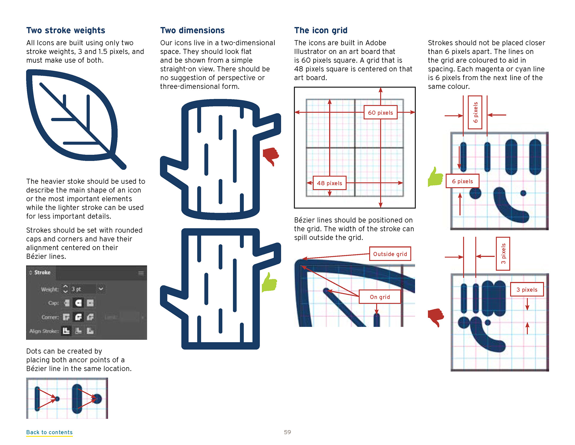
To address this, I developed a custom icon framework built around a standardized grid system and clear design principles. The system ensured consistency in scale, line weight, proportions, and simplicity while allowing the icon library to grow over time. Supporting assets included digital and print versions optimized for both coated and uncoated stock.
































































































Icon Guidelines
The icon system became a core component of the FortisBC brand standards, complete with usage guidelines and production specifications. The result was a flexible visual language that enabled teams across the organization to create clear, consistent communications while maintaining a cohesive brand experience.
Additional Contributors
Many of these icons were created by members of the FortisBC graphic design team, using the icon guidelines and grid system.
Many of these icons were created by members of the FortisBC graphic design team, using the icon guidelines and grid system.